Apollo icon
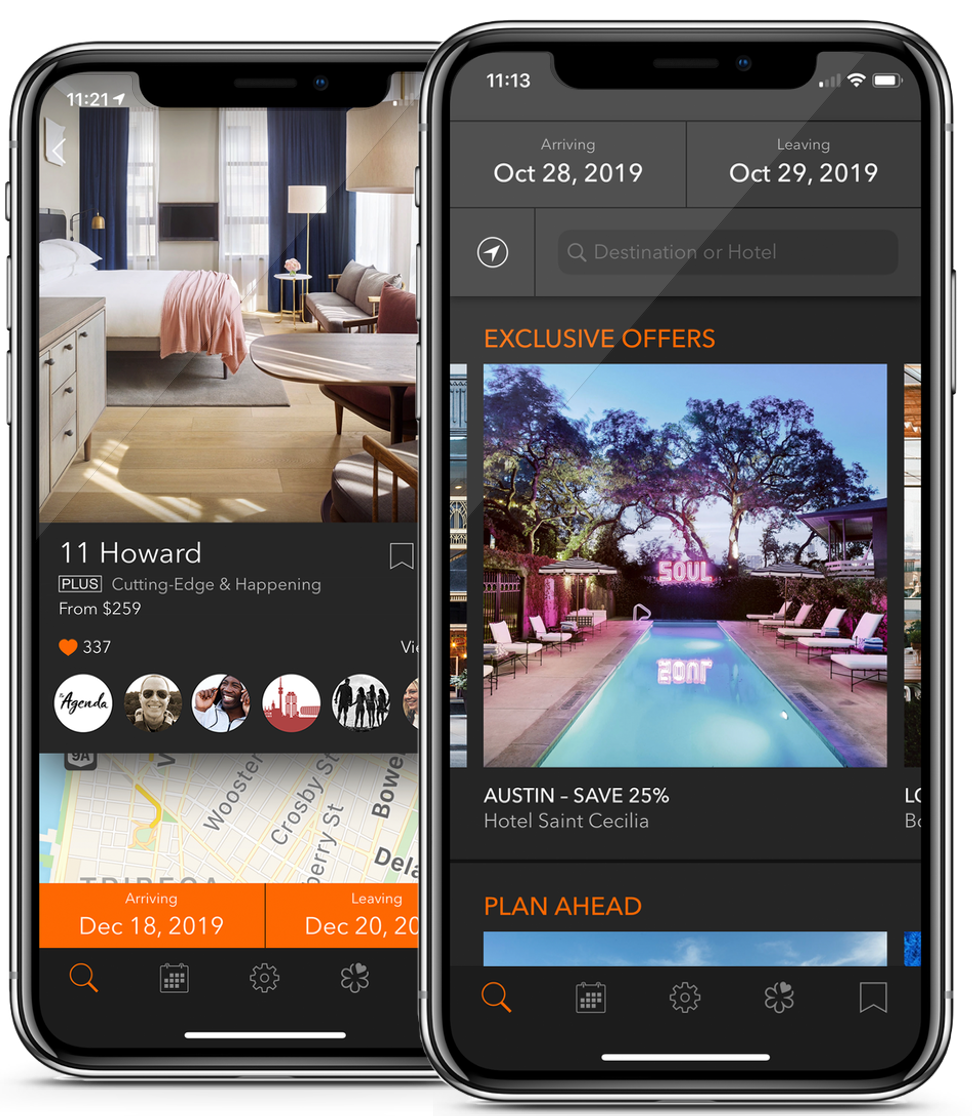
Tablet app screenshots

My Role

Principle UX Designer @ Tablet Hotels

In my three years at Tablet Hotels, I performed a variety of tasks and took on many projects. Chief among them is helping convert their site to a responsive site ready for mobile, as well as desktop, resulting in 12% WoW increase in bookings.

While gathering research for the conversion of the site, we found our customers #1 request was a native app. I then lead the creation and development of the app, eventually becoming app of the day on the app store.

Below I describe my process for making the app, and although I do not describe the desktop overhaul, the process was the same.

My Design Process


I follow the standard UX Design Process, some may vary in language a bit, but the fundamentals are this:

Empathize


Tablet Plus was a membership program, where a customer paid a yearly fee and had access to upgrades and perks at participating hotels. These customers accounted for 80% of our business, even though they were only 20% of our user base. We focused on these customers exclusively.

To learn more about our most important customers, I reached out to them and conducted a series of both phone and person to person interviews. I also sent questionnaires to them using google forms.

Define


Through this process I was able to form three persona's that helped our team focus on them when making decisions.

The Consultant

Travels a lot, so he wants to stay in nice hotels for the service.

Mostly booked through an assistant, but occasionally needs to book an extra night on his own while abroad.

The Jetsetter Couple

Love to travel as much as possible.

Generally start travel plans while lounging on the couch on phone, but finishes on the desktop.

Loves using maps to search for new destinations.

The Family

Love to travel as much as possible.

Prefer convenience over price.

Love to use maps to find landmarks near the hotels.

Prefer populated areas to show their children other cultures and landmarks.

Ideate


Through the definition process, a problem point we recognized is that many hotel booking services all do the same thing and lack any differentiation.

After brainstorming with various members of the company, we came to the conclusion that being in the enviable position of having passionate customers who love to travel, we can differentiate by offering a way to save lists of their favorite hotels and put a social aspect on top of it.

Side note: Through discovery we learned that our Tablet Plus members often would be to embarrassed to bring up their membership status and the perks they are scheduled to receive. We then changed our customer service process by calling the hotel to remind them of the perks for our customers before they arrive resulting in happier customers.

Prototype & Test


We immediately started testing low fidelity paper prototypes with our targeted customers to validate the idea. We found that they loved the idea. A few people mentioned it would open up a new way to find places to travel by following lists of people who's travel ideas they respected.

With the feature validated, we began the process of iteratively making wireframes and prototypes and then testing them with our users.

Each round of testing would result in analyzing the results and adjusting, progressively increasing the fidelity as we went along.

The video in this section is an 10 minute example of part of a usability session I conducted, using a prototype I built using HTML/CSS. In it, you can see where finding and booking a room was successful, the checkout process and design made it confusing for the user to complete.

Specs & Deliverables


Below are some examples of wireframes and flows created throughout the process, including motion animations made to provide the developers guidance.

View the wireframe

An exploration in providing recommendations to customers, and allowing Hotels to be voted into the Tablet curated hotel list explored during the 'define' phase.

View the spec

Dimensions and spacing for the main hotel card provided for the iOS developers.

Project management

Working directly with two iOS developers I helped manage the development of the first version of the app using a post it note system to define features and track progress.

Results


The app maintains a 4.9 rating on over 3k submissions and was featured by Apple as an app of the day.