Apollo icon
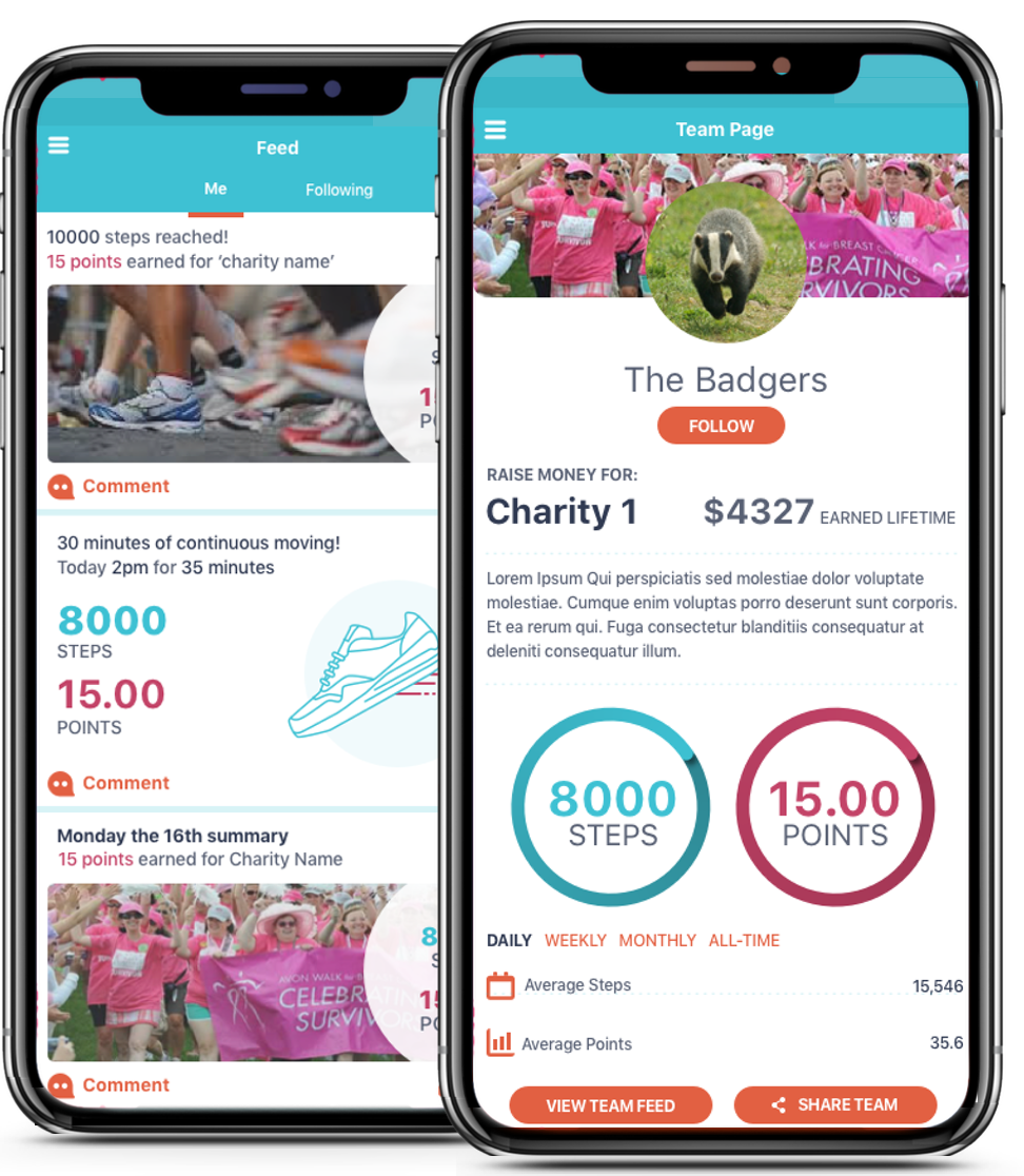
Apollo app screenshots

Walking for Charity

UX, UI & Prototyping @ Ad Theorent

The idea was to create a charity app that rewards users for sharing data; the more you walk, check into locations and complete challenges, the more they give to a charity of your choice. In exchange, as an advertising company, Adtheorent would very transparently use your location data to analyze.

There would also be a social aspect, where teams could form around charities for added motivation to use it.

My Role

I was brought in early on to help shape the idea into apps for both iOS and Android, provide documentation for developers to work off.

Through discussion we decided the first iteration of the app would be based around walking distance as reward, along with the concept of teams, and also add more rewards iteratively in future versions.

Set the Plan


1. Competitive Analysis

See what the competition is doing to evaluate the industry standards

2. Site Map

Create a broad overview consensus of what the right taxonomy is

3. Use Flow

Create a user flow to pinpoint every screen and interaction point

4. Wireframes

Use the user flow map to create navigation and screens. This usually takes some iterations.

5. Prototype

Make sure everything fits together, and be used as a spec for developers to use while coding. This usually takes some iterations.

6. Visual Design

After all the major decisions are made, add color and visual design, then replace screens in the prototype

7. Documentation

Create any documentation developers would need beyond the functional prototype and screens

*With a user testing budget, a step would be added after prototyping.

1. Competitive Analysis


I started by identifying best practices for the type of app that is asked to be built by completing an informal competitive analysis. In this case I needed to learn about both walk tracking type apps, and similar charity apps that rewarded users in various ways. I downloaded and used them all as I brought myself up to speed on the project details.

2. Site Map


The site map defines the taxonomy and forms the basic navigation of the app, while bringing everyone to a consensus of where information is placed. This was a basic app and did not require research to form the taxonomies, but I've held card sorting exercises for things like this before. I've also made use of amazon's mechanical turk to solicit answers for categorization purposes in the past.

3. User Flow


Making a user flow map helps me identify all the screens and decision points the user has to take. Are they logged in? Have they registered? Is their device matched to their phone? What they see depends on lots of things, a user flow keeps track of all those things and helps me identify all version of the screens that need to be designed.

4. Wireframes


Here we focus on placement of information and navigation. The wireframes were designed with iOS design standards in mind. They are updated for Android in the visual design stage. Once the main screens are agreed upon, all the secondary screens, such as setup flows, settings, login screens and empty states, are wireframed, using the user flow map to make sure every state is accounted for.

5. Prototype


Lately I've been using invision to make basic prototypes as I did with this project. When a project requires animated transitions, I can make native prototypes with Xcode, or use apps such as Pixate or Keynote to work out the motion and ultimately guide the developers.

Prototyping is the most effective way to gain meaningful feedback from the team, consensus from stakeholders and approval from senior leadership. They are also a great starting point for usability testing if inside the budget.

6. Visual Design


The Android version was to be developed first, so the visual design adapted the wireframes to reflect its design guidelines.

7. Specs


Specs for a project can range from basic overviews, where the prototype and screens are enough, to detailed down to the pixel. It depends on how involved someone close to the design is during the coding phase, and the development team itself.

Reflections


The project was super interesting to work on, I had never designed for an activity based app before and it was fun to explore. It was also great working with a small, but dedicated team from adTheorent in Matthew and Wes. Unfortunately the project was discontinued for various reasons right after the Android visual design was done. It would have been great to see this one in the app stores.